I wanted to show you the before and after of our main bathroom.
This bathroom is off the hallway between the two bedrooms. Some might argue that not having an en suite bathroom for the master bedroom is a negative but I actually don't mind. It is just the two of us living here so it's not like anyone is going to see me walking five steps down the hallway in my nightie or anything.
The bathroom must have had some sort of refresh in the past 75 years because the cupboards and the sink were obviously not original. It definitely needed updating but the overall layout was good so we didn't have to monkey with moving the plumbing or anything.
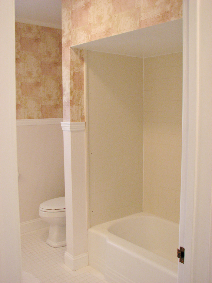
Here are some befores:
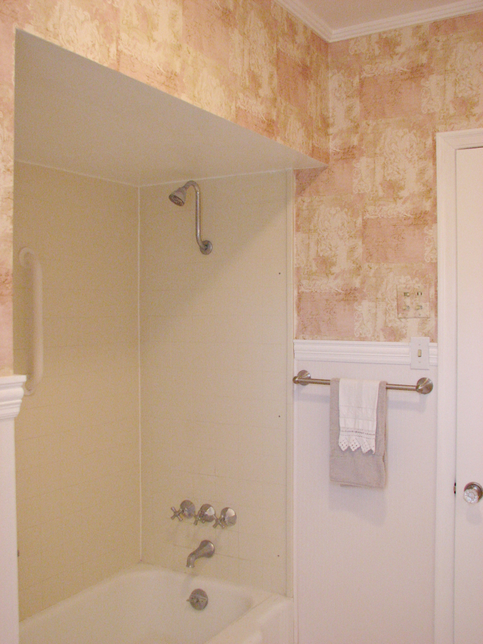
The above is looking in from the hallway. The tub had a very low soffit above it. So low that Rick couldn't stand in it without his head touching the ceiling.
Another angle. That wallpaper though. It looked like a collage of paper scraps with writing on them.
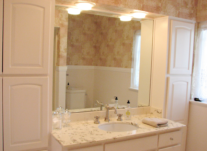
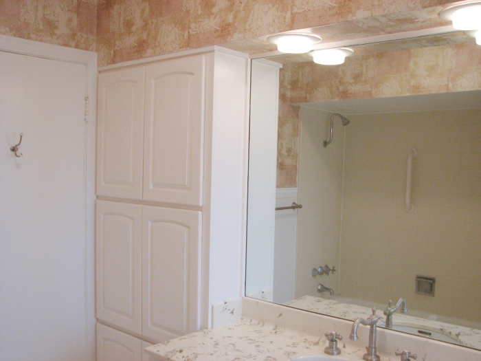
Here is the sink area. Another soffit. I'm not sure what the counter was made of. Some sort of composite. It doesn't look too bad in this picture but in real life it was super busy looking.
And looking towards the door. The bathroom has plenty of cupboard space, that is for sure. Not sure I would have picked that style of door but they are in good shape so we kept them. Other than that and the toilet everything else was gutted. The cupboards look white in the photos but in reality they were a pinky, beige color. Kind of like a band-aid.
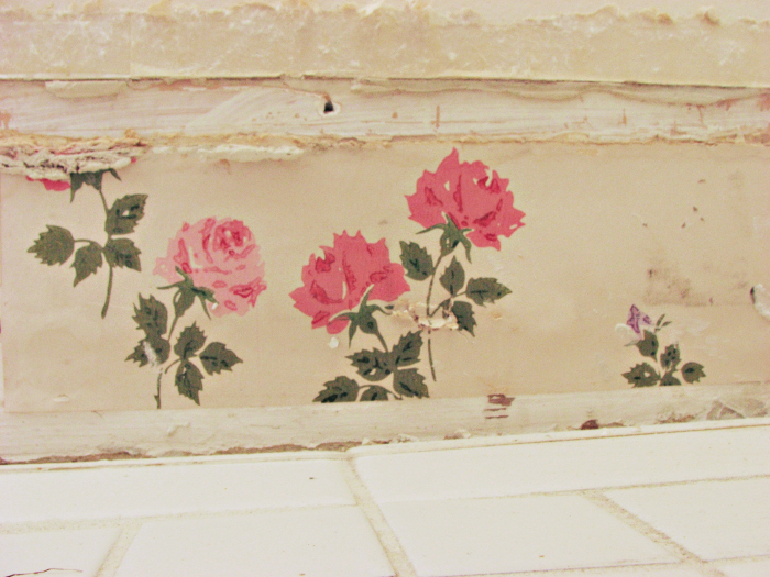
One last before picture. When the baseboards were removed some vintage wallpaper was revealed. I thought it was a sweet detail and I love these kinds of glimpses into the history our home.
Okay on to the new! And by new I mean four years ago!
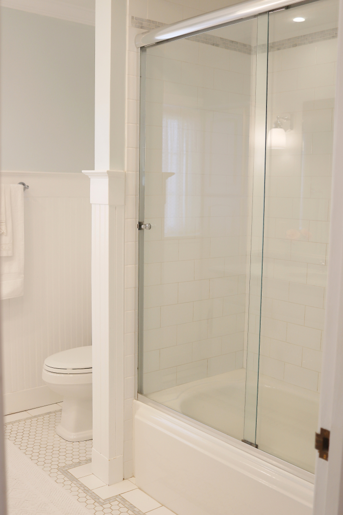
I love the end result but let me tell you getting here was a nightmare. We hired a general contractor and the guy that came out to do the work was so utterly incompetent. Things, as they do with remodeling, took WAY longer than quoted and the work was so shoddy. The general contractor fired the first guy and had someone else come in to finish. We had to actually hire our own tile guy (who was completely fabulous) to do a proper job on the tiling. Here's a tip – always hire a tile person to do tiling. Not a general contractor and not a flooring person. Someone who specializes in tile work.
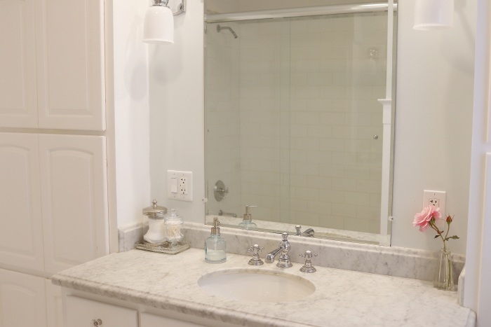
(with the magic of Photoshop I edited out the light switch. It was making me mad)
The general contractor was completely sorry about how things were working out and really worked with us to make things right. What should have been done in two weeks took about seven. He said that every now and then you have a job that goes completely south and in this case it was ours.
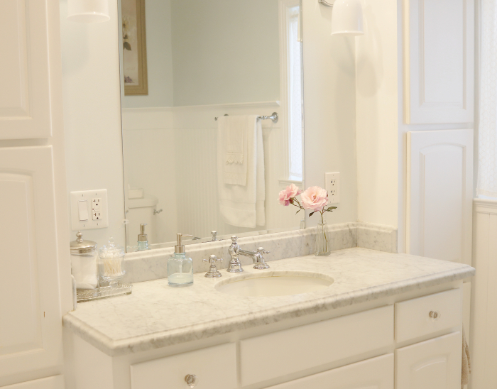
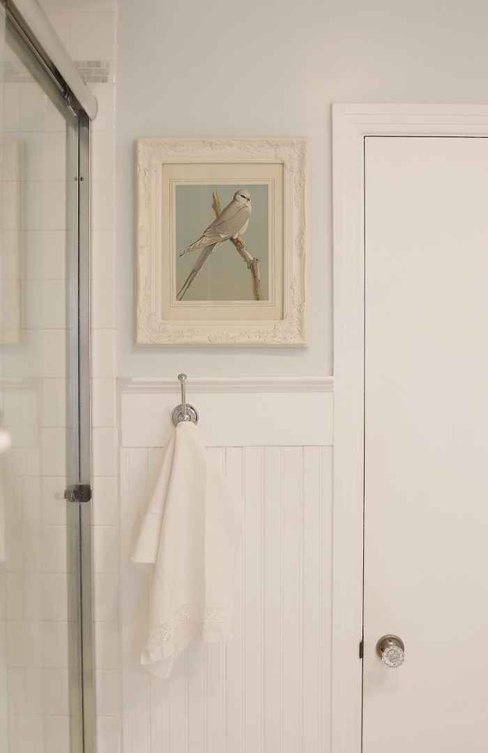
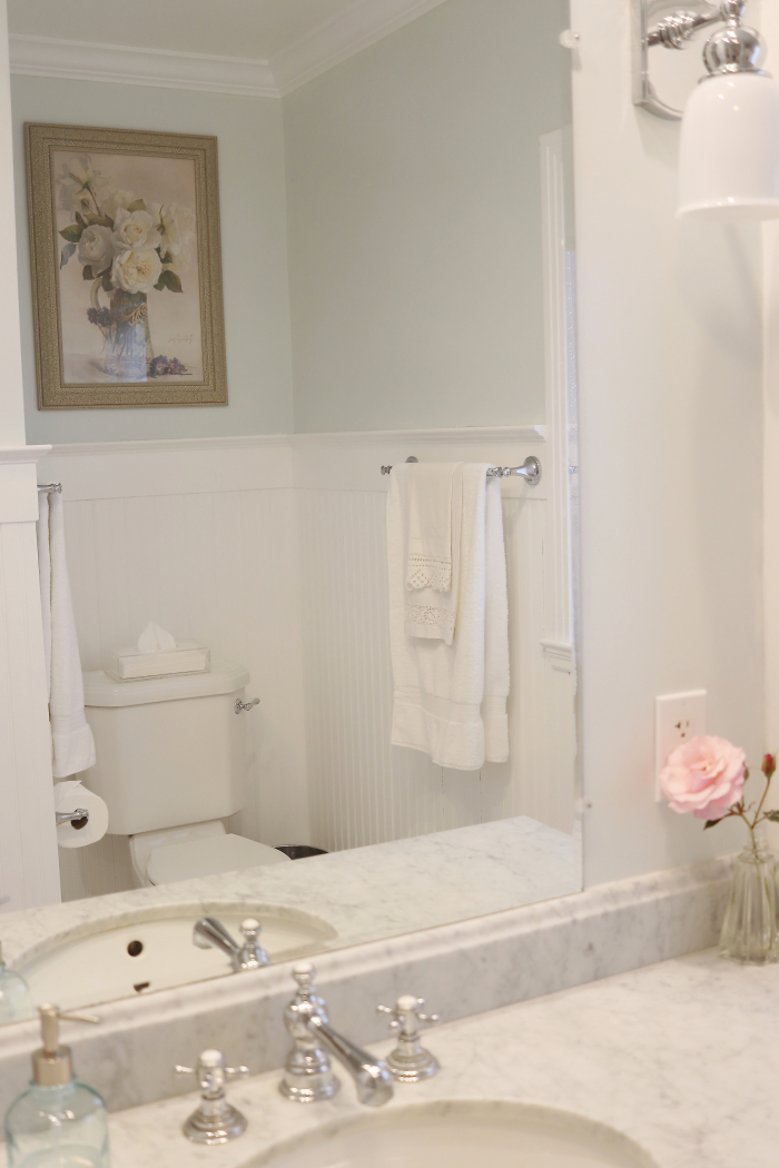
I did an inspiration board before we started and for the most part what I envisioned is what we did. The exception being the wall color. We have white beadboard on the lower part of the walls (which Rick installed) and above we went with a pale aqua color which is so not like me but it just worked with the marble counter top. I was thinking I would do a pale taupe or grey but just could not find the right shade.
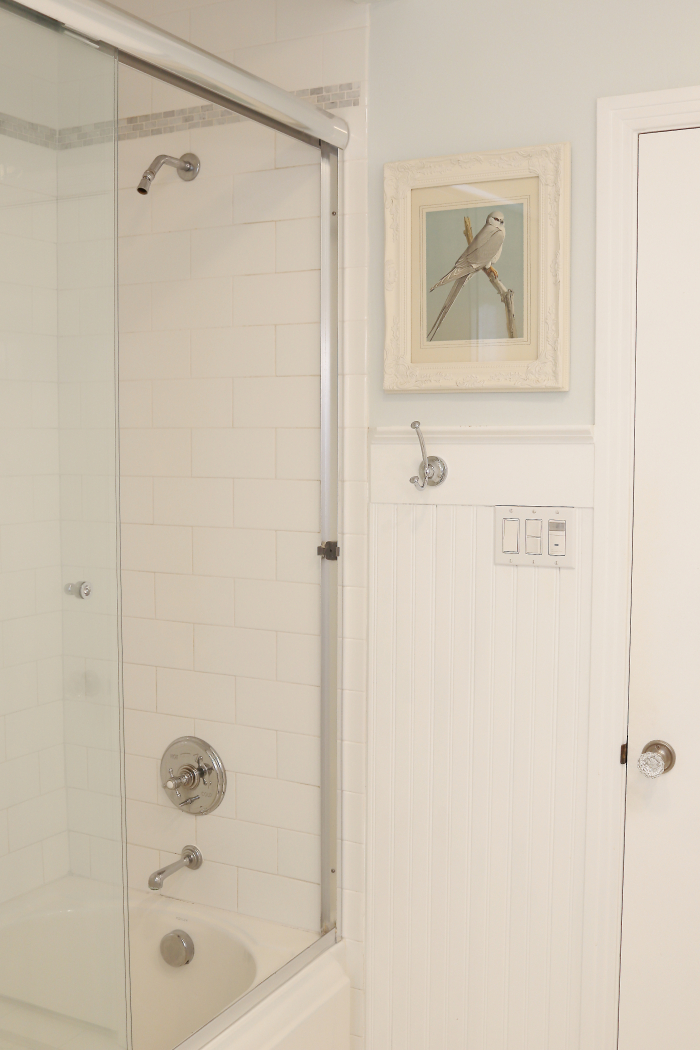
We used the same tub we did in our last house. Opening up that soffit made such a huge difference. We were afraid there might be duct work or something it was hiding but it was just empty space. A design choice they did back in the 40's when everyone was five feet tall.
The one thing I wish we had done differently is to have a recess for shampoo and the like. I think our initial thought was we wanted it to be more in keeping with the 1940's (when the house was built) which wouldn't have had such a thing. We have one of those over the shower thingies (removed for staging purposes) and it's okay.
(see why I edited out the light switch above?)
We lucked out on the marble counter top. We went to a stone yard (is that what they are called?) and there was a small piece left over from another project and it was exactly the shade I wanted. The price was great too. We went for honed rather than polished because I love the kind of Parisian cafe vibe it gives.
We still need to find a proper mirror for the space. I'm conflicted if I want to do something simply framed in chrome or go with something kind of Venetian which would be beautiful but not the least bit era appropriate.
I also want to replace the door but we have a few others in the house that need replacing too. Half the doors are original and a solid single panel. And half are flat, hollow core doors. It's on our household to do list to get those all replaced.
I hope you enjoyed this little tour and look back at our bathroom.
Here are some links to the fittings and accessories used
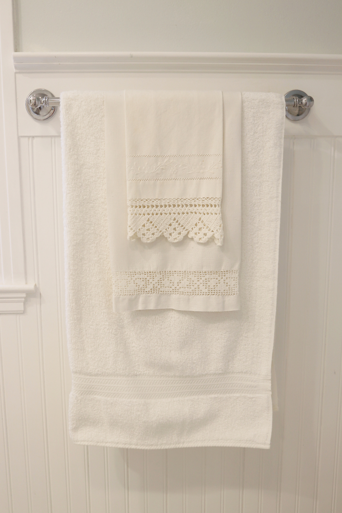
Towel bar and toilet paper holder
Acrylic tissue box (similar)
Wall color – Benjamin Moore Winter Ice
Tub shower head (we replaced the shower head with an unrestricted flow one)
Thanks for posting the links. I just ordered one of the sconces. I have a 12ft ceiling over the sink and way up high is the ugliest wall sconce you have ever seen. I’ve been looking but couldn’t find the perfect light. Can’t wait to get it installed!!!
Oh I hope you love it as much as we love ours.