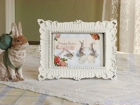
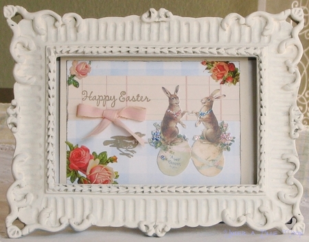
Since I petered out on the Christmas cards I thought I might try my hand at Easter cards. I’ve mentioned the Stamp Art Shoppe in Roseville, CA ~ fabulous selection of stamps and so many great inspiring pieces on display. I can spend HOURS in there just browsing. I saw a small card that was similar to the one I tried to recreate above.
I’m just never satisfied with my renditions. I don’t know if it’s because I’m looking at too long or if it really is just crap but instead of looking whimsical or creative or artistic they end up looking like low-rent versions of what I had in mind. Grrr.
I think it’s a matter of proportion. I think I need a focal layer and then smaller embellishments to enhance it.
Those bunnies should be bigger. And seriously – the inspiration piece was so cute and vintage looking and mine just looks like a six year old’s paper and glue project. Inspiration piece had a pale blue check background. Check. Inspiration piece had lined school paper. Check. Inspiration piece had vintage image. Check. Inspiration piece had floral details in some of the corners. Check. Inspiration piece had salutation in cheerful, loopy font. Check. Inspiration piece had small stamped image. Check. Inspiration piece had little pink bow embellishment. Check. Sigh.
I am loving German die cut paper (the roses in the image above). Intricate little pieces in vivid colors that glue on like a dream. And best of all they are mostly cut out so there isn’t too much cutting that needed (just little tabs that need to be snipped off) so my kitchen floor isn’t littered with itty bitty pieces of paper.
If anyone has any recommendations for books on collage art or collage type cards feel free to send them my way.


Well, it looks pretty good to me. But, knowing you, more stuff would be better. Especially glittery stuff and more ribbon.
I’m kinda a “clean lines” girl myself, so I love it. Love the lay-out and colors, it works for me. I love German Scraps too. I think you did a great job.
c
I love your card, too. However, looking at it with my non-artistic eye, I think I can see two small areas that might improve it. I think I’d lose the little bird that’s being almost hidden by the pink ribbon and maybe turn the “Happy Easter” on an angle. It might also help if the flowers were less bright, or if the bunnies were brighter, color-wise. Since you’re going for a vintage look, I think maybe the flowers could be lighter…maybe some white glue layered over them would help fade the colors somewhat?
Either way, I do love the card and think it’s terrific!!! You’ve got a better eye than me, for sure! 🙂
You are way too hard on yourself. I think your card is gorgeous! I often find trying to replicate something else always leaves me disappointed. Use what you saw as inspiration but make it your own with your own individual stamp on it.
If you want it to look more vintage, dab some cold tea over it very gently. Nothing exciting and new there but it does work. Use different embellishments, play around and have fun. You may be surprised to find that what you create inspires someone else!
Oh I love your little bunny card!! I just love Easter though,so I’m a sucker for anything pastel with bunnies.
On your last post about peeking into other bloggers homes, I’m totally with you there. Matter of fact I love your kitchen! I like the cabinets and your taps for your sink 🙂 So, no you are not alone.
I think that is really cute… you are too hard on yourself, as many of us tend to be!!
I think your card is beautiful!!! …but I LOVE your kitchen!!! (in the previous post)
Truthfully, I think it’s just delightful!