
I’ve come to the realization that I am a color wimp. In decorating, in clothing, in general. My palette tends to be pale and subdued.
You know when you open a decorating magazine or walk into a room that just speaks to you there is a feeling of ‘ahh – yes. This is where I belong.’ Well that generally only happens to me when the colors are soft and there is a lot of white involved. Sheer, lacy layers of things going on.
That isn’t to say that I’m not excited by bright colors. Some people just get the right mix of bright and cheerful that isn’t too overstimulating. I admire those people. There are a number of blogs I have listed to the right that do it just right. Lovely rooms done in yellow, red and with a little muted green for balance. Or bright pink and green and lots of white. I can totally appreciate those rooms. But I can’t decorate like that.
I’ve never been able to do it. I painted a dining room wall rose and after about a week it looked tired and dated to me. I painted the boys’ room a bright blue (it was supposed to be a pale blue but you know how paint can turn on you) and I felt like I was drowning when ever I went into the room.
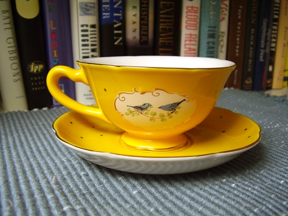
 So my walls will stay pale, my furnishings muted. But I can shake things up a bit now and then. As long as I do it in small doses. Like this teacup I bought at Anthropologie. How cheerful is that?
And I have my eye on these Pierre Deux fabrics (or something similar) to make a table topper. I can picture August’s in these bright, vivid colors.
Next thing you know I’ll be decorating like this.
lovely cup and saucer…I tend to stick to soft colours too, but every now and then I throw in a surprise…like red! Just for fun!
Whoa! That bright colorful room was a shock! I like my colors more on the muted side, too. And I love that teacup. I’m going to be near an Anthropology next Monday – I may just wander in and find one for me ~
I love those cups. How funny that we both posted about bluebirds today!
I know what you mean…I too tend to go with the muted colors. I love bold colors but I am just not brave enough to use them myself.
What a darling teacup. You can always count on Anthropologie
O_O OOOoooooo! do they have pink birdie tea cups too? I was at Anthropologie on Sunday in Carmel and I didn’t see those. Youknow who loves Anthropologie almsot as much as we do? Ahren. I think working at Banna Republic did something to him and now he goes to Anthropolgie and has to comment on the way they merchandise thigns and pouts that they don’t sell boy clothes.